
Grids

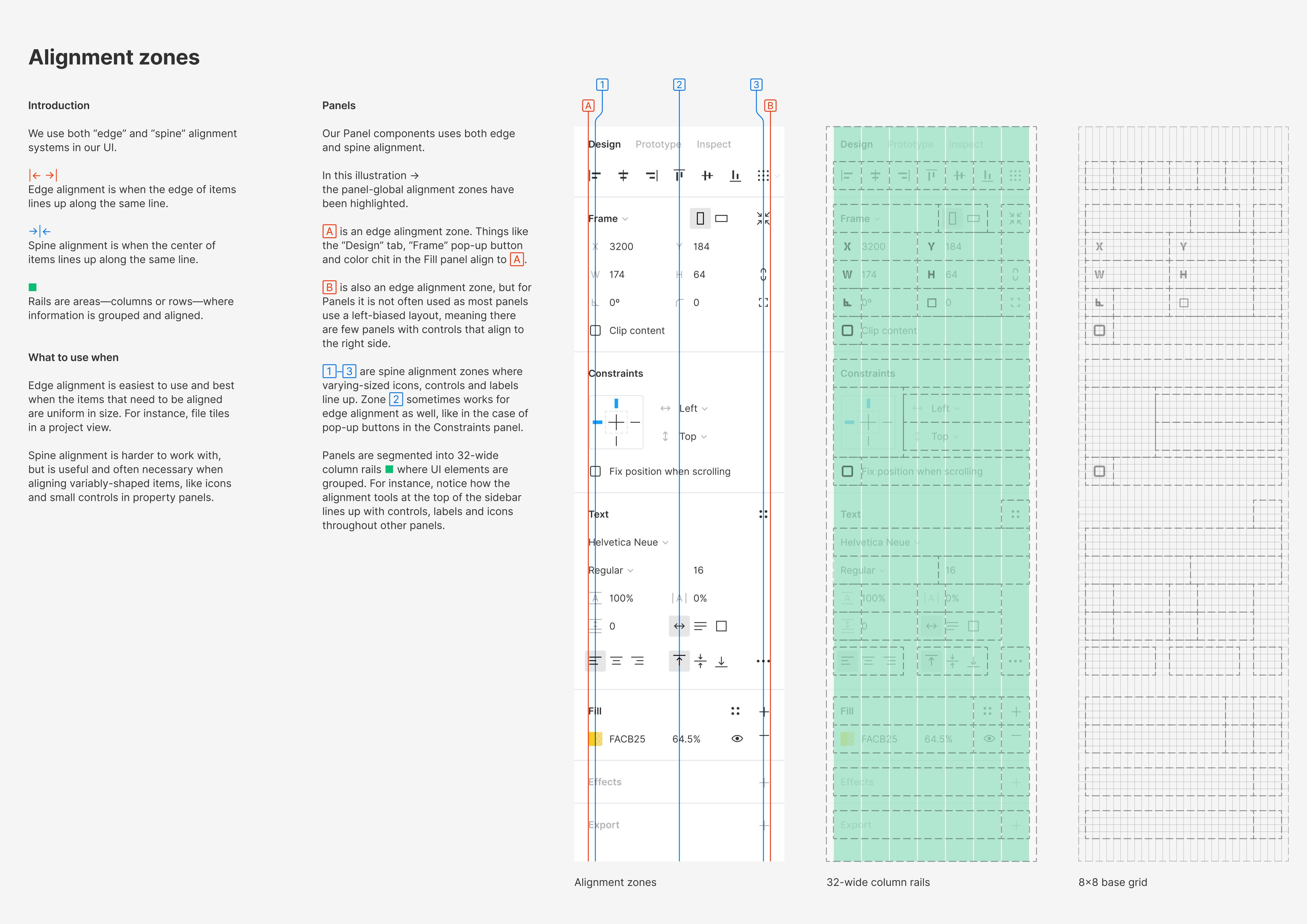
Throughout my career in user interface design I have sought to create balance and harmony through a combination of whitespace, typography, color, and content. One tool I have never fully embraced is the grid. I first began trying in approximately 2010 using GuideGuide, an early Photoshop plugin. With GuideGuide you can enter a few values and a perfect grid appears on your artboard. However, whenever I try to enforce a rigid grid I end up breaking it more often than allowing it to lead.
Elements on the page beg to be placed a few pixels away from a gutter. Text boxes become constrained. It’s frustrating as a designer to ignore something you carefully configured.
The above example from Figma and UI2, their updated design system, is a masterful example of both grid design and implementation. I plan on encouraging my team to think about how new designs can embrace a simple grid.